Friday, June 28, 2013

*NEW* White Washed, Retiring Products, + Freebie!


Hi Everyone! Well, we had an eventful evening last night. Nolan fell and cut his forehead so now he's sporting some glue and steristrips. Thankfully we were able to avoid having actual stitches for his sake, the poor thing. We also closed on our new house this last week, so we are very busy!

I have a lot going on this week for my designs. Unfortunately, my guest spot at ScrapMatters is almost over. I have another spot lined up at Oscraps. So you will see my stuff there starting next week.

I do have something new for you this week! White Washed is a neutral collection that will coordinate with any of your scrap kits. Add a little something extra to your LOs. I'm sure you'll find it a go to collection full of scrapping essentials. Everything is 20% Off through Sunday and save more by buying the whole Bundle at 27% Off.


I also have a few products that I am retiring as I leave ScrapMatters. These products are 50% Off through Sunday and won't be coming back at Oscraps.
 
 
And I have a freebie for you today. I made this banner for you that coordinates with White Washed. Enjoy!


I will be back next week with a new collection for you at Oscraps! 


Friday, June 21, 2013

*NEW* Lazy Days + Freebie!


Happy Friday Everyone! This has been a crazy week getting home from vacation. The boys are slowly adjusting back to Michigan time and were up about 8:30 today. The first morning we were back one slept until 10:00 and the other 11:00. I wasn't complaining! I just hate the unpacking process with a passion! And really, even though we unpacked from the trip, we are working on packing up the whole house to move by mid July into our new house that we close on next week. This new house is in bad need of some updating so this week has been full of picking flooring and counter tops, and tile, and paint colors, mostly so we could pick the paint and have it painted before we move in. The other projects will hopefully be completed over the next year but I realized that you have to have a good idea of the whole project before you start any part of it, or you might run into trouble later. But it's fun to look at everything.

So on to today's new release. Lazy Days was created for the Fix at DSA last month. If you grabbed it there, the kit is exactly the same except I added one paper. If you bought it at DSA, email me and I'll be happy to get you that extra paper to complete the kit. I've added alphas, journal cards, and cardstocks. Everything is 20% Off through Sunday. The Bundle is 28% Off if you want to save more!

 
I made a cluster freebie for you that coordinates with Lazy Days. Enjoy!


I'll have something a little different for you next week that's new! See you then!


Monday, June 17, 2013

Manic Monday at ScrapMatters - 50% Off Today ONLY!


It's Manic Monday at ScrapMatters today and I have 3 kits at 50% Off today only! You can grab Garden Patch, Fabulous 50's, and Strawberry Fields for 50% Off. Happy Shopping!


Friday, June 14, 2013

*NEW* Brothers and Sister + Freebie!


Happy Friday Everyone! I'm a little late posting today as I've been on West Coast time here. We just finished up a couple days at Disneyland and had a blast. The boys were so excited about Carsland and I was impressed by it, it was amazing! Just a couple more days here in Phoenix and then we'll be headed back to the Midwest!

I have a brand new collection for you today called Brothers and Sisters. It has a good mix of boy and girl elements and word art for brothers, sisters, or siblings. I hope you enjoy using it to scrap those very special relationships. The kit, alphas, journal cards, extra word arts, and cardstocks are 20% Off through Sunday and save more by grabbing the whole Bundle at 39% Off.


I also have a freebie for you today. Joey made you this cluster frame that coordinates with Brothers and Sisters! Enjoy!


Next week I will be back with something else new and be sure to stop by on Monday as it will be Manic Monday at ScrapMatters. I will have 3 kits at 50% Off on Monday only! Have a great week!


Friday, June 7, 2013

Fabulous 50's, Strawberry Fields, + Freebie!


Hi Everyone! I'm writing from sunny and hot AZ today. We had a nice flight out yesterday and are having a great time visiting with my inlaws. The kids don't ever seem to get the memo on the time change so here I am when it's not quite 7 AM here! Nolan asked to go swimming half and hour ago and I said no as I wasn't even close to awake yet and he said, "But it's 80 outside." Yes, 80 at 6 AM, and I fully acknowledged that that is swimming weather but we're headed out for a breakfast picnic and the splash pad at the park in an hour, so hopefully that will satisfy the swimming urge.

Today I have Fabulous 50's and Strawberry Fields back at ScrapMatters. Everything is 20% Off through Sunday or grab the Fabulous 50's Bundle for 26% Off and the Strawberry Fields Bundle for 28% Off to save more.


Joey made this cute cluster freebie that coordinates with Fabulous 50's for you today. Enjoy!


I will be back next week with a brand new collection for you! 


Tuesday, June 4, 2013

Blending Tutorial by CT Emmy


Blending Photos into the Background Paper Tutorial

*To follow this tutorial one should have a working knowledge of Adobe Photoshop CS5. I am not sure how this translates into other programs or versions of programs.

This is my LO that this tutorial is based on:


 For me the blend is the last thing that I do on a page. Once my element placement, journaling and title work are done I can decide whether or not a blend will go well on the page or not. No matter when you add the blend to your page, the entire process is fairly simple. So, lets get started!

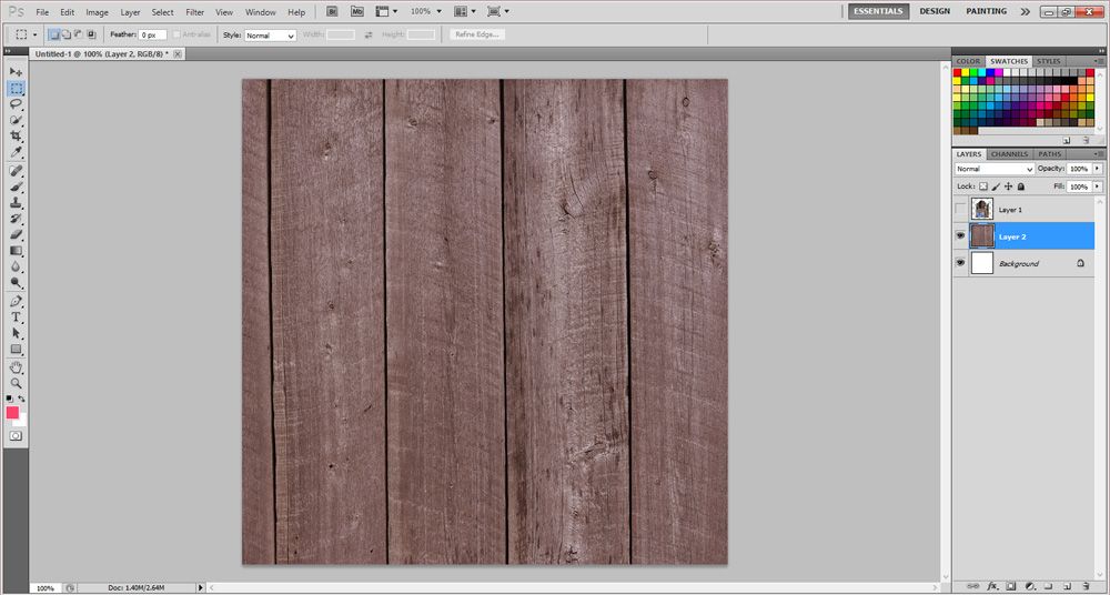
1. Open the paper of your choice. I am using the wood grain paper from Country Kitchen by Snips and Snails Designs this specific paper is found in the Country Kitchen Add-On.

 
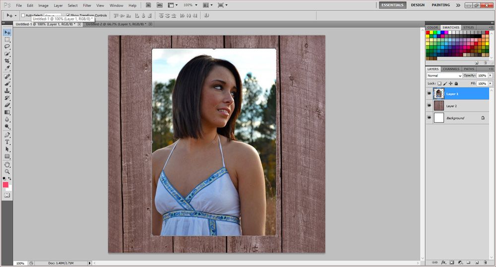
2. Pick a photo, preferably a good quality, large and one that is not too much of a close up.  Place it right on top of your paper layer and edit the photo to your liking.
 
 
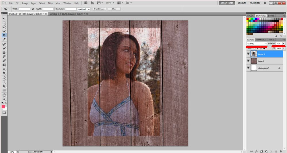
3. Change the blend mode of the photo. I am using Overlay for this tutorial but I have used Soft Light and Hard Light before depending on the effect that I am going for. Also, play with your opacity. Pick a setting that you like but don't make it too light. I usually use 75%. As you can see, this adds a very nice worn look to the paper and the photo. It blends it so nicely with the paper.
 
 
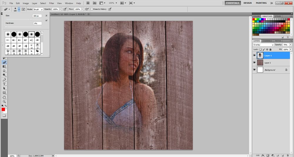
4. After this I take a low opacity brush and use it to take away all the hard edges from the photo. & Viola!


This is so easy and can add a really great touch to your layout!! I hope you learned something new and this was clear for you!
 
Emmy :)